출처 : https://developer.apple.com/tutorials/app-dev-training/creating-a-card-view
Creating a card view | Apple Developer Documentation
Scrumdinger keeps a list of daily scrums that the user attends, and it displays that list in its root view.
developer.apple.com
안녕하세요. 리액트해본 스위프트 입문자입니다.
블로그 글 쓰는게 공부하는 것보다 더 오래걸리는 것 같습니다.
쓰다보면 좀 더 빨리 쓰게 되겠죠..?
1. 프로젝트에 Models 라는 이름의 그룹 추가
: 폴더 추가 같은거임.
그 안에 Theme.swift 라는 파일을 생성하라함.

생성 완료!
2. Create an enumeration Theme
import Foundation
import SwiftUI

enum Theme: String {
    case bubblegum
    case buttercup
    case indigo
    case lavender
    case magenta
    ...

    var accentColor: Color {
    	switch self {
        	case .bubblegum, .buttercup, .lavender, ... : return .black
            case .indigo, .magenta, ... : return .white
        }
    }
    var mainColor: Color {
    	Color(rawValue)
    }
}
: 테마 enum을 생성함.
3. Create a daily scrum model
struct DailyScrum {
    var title: String
    var attendees: [String]
    var lengthInMinutes: Int
    var theme: Theme
}
: DailyScrum이란 구조체를 만듬.
extension DailyScrum {
static let sampleData: [DailyScrum] = [
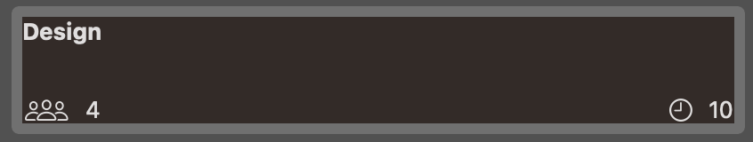
DailyScrum(title: "Design",
attendees: ["Cathy", "Daisy", "Simon", "Jonathan"],
lengthInMinutes: 10,
theme: .yellow),
...
]
}: DailyScrum 모델 (샘플) 데이터
3. 카드 뷰 만들기
PreviewProvider은 필수로 작성해야 하는 코드가 아니고 생산성을 위한 코드인건가..? // todo
struct CardView_Previews: PreviewProvider {
    static var scrum = DailyScrum.sampleData[0]
    static var previews: some View {
        CardView(scrum: scrum)
            .background(scrum.theme.mainColor)
            .previewLayout(.fixed(width: 400, height: 60))
    }
}
previews는 CardView(scrum: scrum)를 렌더함.
scrum이란 변수 이름으로 DailyScrum 구조 모델에 기반한 샘플 데이터의 한 부분을 선언했음. - displays a piece of data in the DailyScrum structure.
CardView()에 scrum 데이터를 매개로 전달.
PreviewProvider 자체에서도 배경 색이나 크기(.previewLayout)를 지정 가능함.
import SwiftUI

struct CardView: View {
    let scrum: DailyScrum // Add a constant named scrum of type DailyScrum.
    var body: some View {
        VStack(alignment: .leading) {
            Text(scrum.title).font(.headline)
            Spacer()
            HStack {
                Label("\(scrum.attendees.count)" , systemImage: "person.3")
                Spacer()
                Label("\(scrum.lengthInMinutes)", systemImage: "clock")
            }
        }
    }
}

상수로 scrum 데이터를 전달 받음. 그 데이터에 따라 제목과 라벨이 렌더됨.
.count : 리액트의 .length와 같음. 개수를 나타냄.
Label이나 Spacer 등은 코드를 직접 입력하거나 Xcode의 추가 버튼에서 찾아 끌어붙일 수 있음.
라벨 텍스트 안에 "\(데이터)" 이런식으로 데이터 출력 가능함. 리액트의 ${}와 같음.
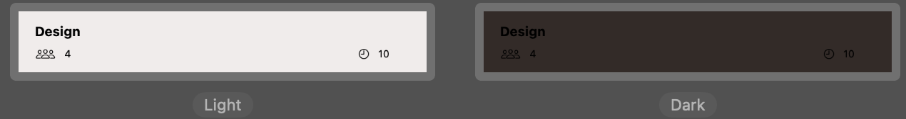
스타일 속성 추가하고 라이트, 다크 모드로 보기
4. 재사용 가능한 커스텀 라벨 스타일 만들기
: With the LabelStyle protocol, you can create a consistent design throughout your app by reusing the same label style for several views.
import SwiftUI

struct TrailingIconLabelStyle: LabelStyle {
    func makeBody(configuration: Configuration) -> some View {
        HStack {
            configuration.title
            configuration.icon
        }
    }
}

extension LabelStyle where Self == TrailingIconLabelStyle {
    static var trailingIcon: Self { Self() }
}
: The configuration parameter is a LabelStyleConfiguration, which contains the icon and title views.
TrailingIconLabelStyle이란 이름의 라벨 스타일을 정의함. 내부에 makeBody 함수를 생성했음. makeBody는 단순 이름인 줄 알았는데, 자동 완성되는 것으로 보아 역할이 있음.
생성한 스타일(trailingIcon)은 HStack 안에 제목 아이콘 순으로 정렬된 것.
이것은 외부에서 사용하기 위해, trailingIcon이란 이름으로 extension을 생성함.
Self { Self() } : 그 자체를 의미하는 건가.
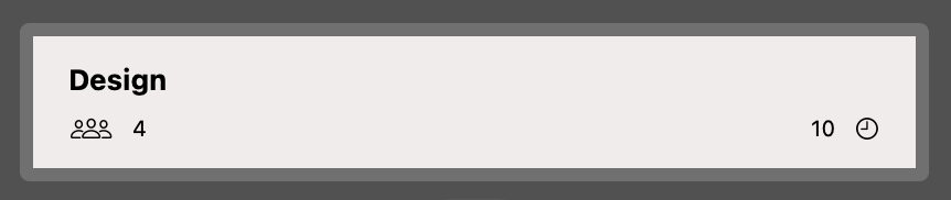
                Label("\(scrum.lengthInMinutes)", systemImage: "clock")
                    .labelStyle(.trailingIcon)
.labelStyle(.trailingIcon) : trailingIcon이란 라벨 스타일 적용함. 스타일대로 변경된 것을 확인할 수 있음.
5. 카드 뷰에 접근 가능하게 만들기
    var body: some View {
        VStack(alignment: .leading) {
            Text(scrum.title).font(.headline).accessibilityAddTraits(.isHeader)
            Spacer()
            HStack {
                Label("\(scrum.attendees.count)" , systemImage: "person.3")
                    .accessibilityLabel("\(scrum.attendees.count) attendees")
                Spacer()
                Label("\(scrum.lengthInMinutes)", systemImage: "clock")
                    .accessibilityLabel("\(scrum.lengthInMinutes) minute meeting")
                    .labelStyle(.trailingIcon)
            }.font(.caption)
        }.padding()
        .foregroundColor(scrum.theme.accentColor)
    }
.accessibilityAddTraits(.isHeader) : modifier(수식어) 역할을 함. 해당 scrum.title을 읽음으로, 뷰의 정보를 전달하는데 도움을 준다.
.accessibilityLabel : 라벨을 묘사함. 주석 같은 역할인지..? // todo
정확한 이해가 아닌 부분이 있다면 언급 부탁드립니다~!
'iOS | SwiftUI' 카테고리의 다른 글
| [상태 관리] Swift - observable, View life cycle (0) | 2023.10.24 |
|---|---|
| [디자인 패턴] MVVM 요약 정리 with Swift (0) | 2023.10.23 |
| [TIL] 스위프트 공식 튜토리얼 따라하기(1) - 스택을 이용한 배열 (0) | 2023.10.13 |
| [TIL] A Swift Tour 대충이지만 읽기 완료! (0) | 2023.09.13 |
| [TIL] 정말로 처음 시작하는 Swift (0) | 2023.09.12 |

